An Economist’s Guide to Visualizing Data
by Daljit Dhadwal
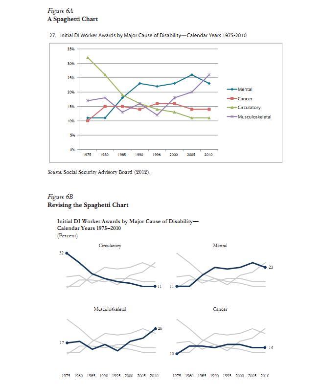
One thing researchers should keep in mind is that graphs in research reports or articles, and even those shown in verbal presentations, are not meant for the author, but for the reader or the seminar audience. The line chart that a researcher uses in the data exploration phase—with default gridlines, tick marks, and colors—may not be the one that will best communicate the researcher’s ideas to others.
The winter 2014 edition of the Journal of Economic Perspectives has a great discussion of graphing statistical data by Jonathan Schwabish of the Congressional Budget Office. He presents three principles: show the data, reduce the clutter, and integrate the text and the graph. He then works through a series of examples applying these three principles to previously published graphs (using Excel). You can download the article from here: Schwabish, Jonathan A. 2014. “An Economist’s Guide to Visualizing Data.” Journal of Economic Perspectives, 28(1): 209-34.