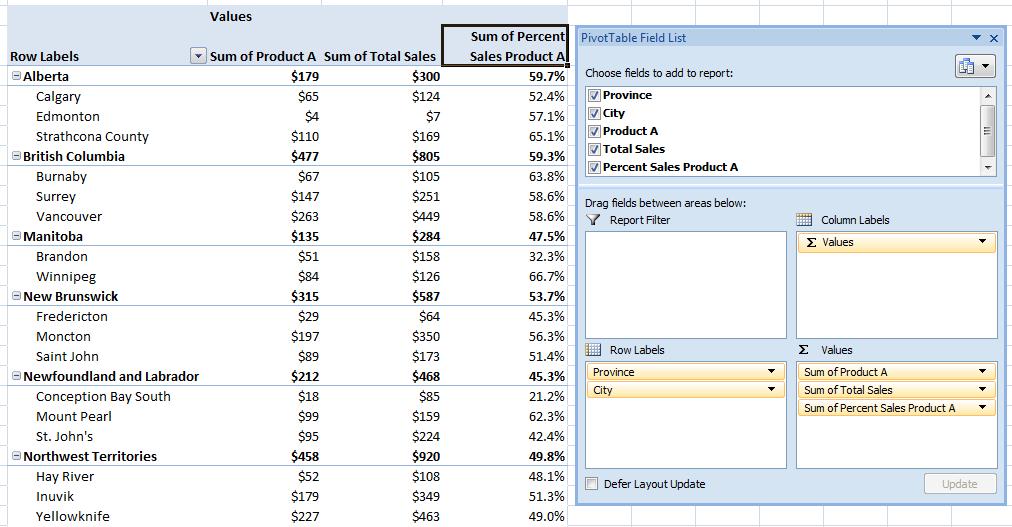
Credit: ©iStockphoto.com/3d_kot
Coding categorical data (such as male/female or geographic region) as dummy variables is probably the most common way of incorporating qualitative data into a regression equation. Under dummy variable coding, the coefficient on a dummy variable in a regression equation is the difference between the average value of the outcome variable for the category that is included and the average value of the base category (the category that is excluded). Dummy variable coding isn’t the only way to incorporate categorical variables into a regression equation. Another coding scheme is called effect coding. Under effect coding, the coefficient on the included category is the difference between the average value of the outcome variable for the included category and the overall average value of the outcome variable.
In the following examples illustrating the difference between the two coding schemes, the outcome variable is starting salary and the independent variable is either male or female.
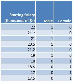
Here is the dummy variable approach:

Here are the summary statistics:
Average value of starting salary for everyone: (22+21.7+21+20.5+21.2+19+18+18.5+17+17.5)/10 = 19.64
Average value of starting salary for males: (22+21.7+21+20.5+21.2)/5 = 21.28
Average value of starting salary for females: (19+18+18.5+17+17.5)/5 = 18
The difference between the average value of salaries for males and females: (21.28-18) = 3.28
The difference between the average value of salaries for females and males: (18-21.28) = -3.28
The difference between the average salary for males and the overall average salary: (21.28-19.64) = 1.64
The difference between the average salary for females and the overall average salary: (18-19.64) = -1.64
Here are the results from running the regression where the outcome variable is starting salary and the independent variable is male:
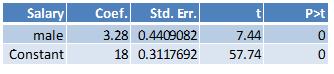
The value of the coefficient on the male dummy, 3.28, is the difference between the average value of the starting salary between males and females. The constant, 18, is the average value of the starting salary for females (the base category).
Here are the results from running the regression where the outcome variable is starting salary and the independent variable is female:
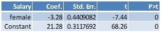
The value of the coefficient on the female dummy, -3.28, is the difference between the average value of the starting salary between females and males. The constant, 21.28, is the average value of the starting salary for males (the base category).
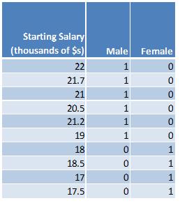
Under the effect coding scheme, the categorical variables are coded in such a way that the values for each categorical value sum to zero. In the simplest case where there is an equal number of observations for each category, the value of the excluded category is set to negative 1. Here is what the above data look like under the effect coding scheme:
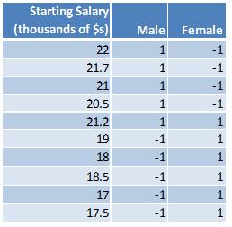
Notice that the sum of the values for male (1+1+1+1+1+(-1)+(-1)+(-1)+(-1)+(-1)) is zero and that the sum of the values for female ((-1)+(-1)+(-1)+(-1)+(-1)+1+1+1+1+1) is also zero.
The summary statistics are the same as before:
Average value of starting salary for everyone: (22+21.7+21+20.5+21.2+19+18+18.5+17+17.5)/10 = 19.64
Average value of starting salary for males: (22+21.7+21+20.5+21.2)/5 = 21.28
Average value of starting salary for females: (19+18+18.5+17+17.5)/5 = 18
The difference between the average value of salaries for males and females: (21.28-18) = 3.28
The difference between the average value of salaries for females and males: (18-21.28) = -3.28
The difference between the average salary for males and the overall average salary: (21.28-19.64) = 1.64
The difference between the average salary for females and the overall average salary: (18-19.64) = -1.64
Here are the results from running the regression where the outcome variable is starting salary and the independent variable is male:
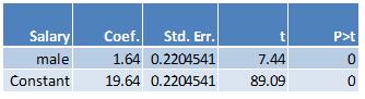
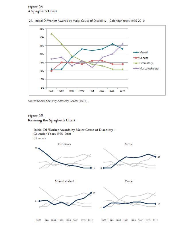
The value of the coefficient on the male dummy, 1.64, is the difference between the average value of the starting salary for males and the overall average salary. The constant, 19.64, is the average value of the overall starting salary.
Here are the results from running the regression where the outcome variable is starting salary and the independent variable is female:
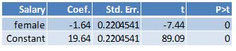
The value of the coefficient on the female dummy, -1.64, is the difference between the average value of the starting salary for females and the overall average salary. The constant, 19.64, is the average value of the overall starting salary.
In the above examples, there are five males and five females. When there an equal number of observations, the categories are said to be balanced. When the categories have different numbers of observations, the categories are said to be unbalanced. When the categories are unbalanced, the values for the categorical variables can be calculated as follows so that they will sum to zero: determine the proportion of cases each group makes up of the total and then divide the proportion for each group by negative one times the proportion of cases that belong to the base category. Suppose there are six males and four females and the data are as follows:
Here are the summary statistics:
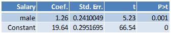
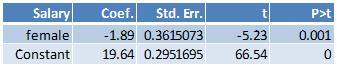
Average value of starting salary for everyone: (22+21.7+21+20.5+21.2+19+18+18.5+17+17.5)/10 = 19.64
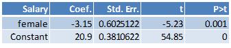
Average value of starting salary for males: (22+21.7+21+20.5+21.2+19)/6 = 20.9
Average value of starting salary for females: (18+18.5+17+17.5)/4 = 17.75
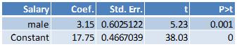
The difference between the average value of salaries for males and females: (20.9-17.75) = 3.15
The difference between the average value of salaries for females and males: (17.75-20.9) = -3.15
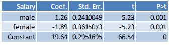
The difference between the average salary for males and the overall average salary: (20.9-19.64) = 1.26
The difference between the average salary for females and the overall average salary: (18-19.64) = -1.89
In the above example, there are six males and four females and therefore the proportion of males is 0.6 and the proportion of females is 0.4. Under the effect coding scheme, the value for the male variable will be (-1)*(.06)/(0.4) = -1.5. The value for the female variable will be (-1)*(0.4)/(0.6) = -0.666666667. The effect coded data will look as follows:
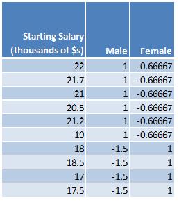
Notice that the sum of the values for male (1+1+1+1+1+1+(-1.5)+(-1.5)+ (-1.5)+ (-1.5)) is zero and that the sum of the values for female ((-2/3)+(-2/3)+(-2/3)+(-2/3)+(-2/3)+(-2/3)+1+1+1+1) is also zero.
Here are the results from running the regression with dummy variable coding where the outcome variable is starting salary and the independent variable is male:
Here are the results from running the regression with dummy variable coding where the outcome variable is starting salary and the independent variable is female:
Here are the results from running the regression with effect variable coding where the outcome variable is starting salary and the independent variable is male:
Here are the results from running the regression with effect variable coding where the outcome variable is starting salary and the independent variable is female:
The results from effect coding are equivalent to constrained linear regression with dummy variable coding where the constraint is that the sum of the proportion of each categorical variable sum to zero. Here’s an example illustrating the constrained regression approach. The data is coded using the dummy variable coding scheme.
Since there are six males and four females, the following constraint is placed on the regression equation: (0.6)*male + (0.4)*female = 0. The regression equation is starting salary = constant + male + female.
In Stata this is accomplished with the following two commands:
constraint define 1 0.6*male + 0.4*female = 0
cnsreg salary male female, constraint(1)
Here are the results from estimating the constrained regression equation:
References:
Additional coding systems for categorical variables in regression analysis; The Institute for Digital Research and Education, UCLA.
Basic Econometrics, 3rd edition by Damodar Gujarati; The above sample data is from page 501 of the text book.
Coding Categorical Variables in Regression Models: Dummy and Effect Coding (StatNews #72); Cornell Statistical Consulting Unit.
Coding Schemes for the Religion and Life Satisfaction Example; Jason Newsom.
Dummy Variables: Mechanics v. Interpretation; Daniel B Suits; The Review of Economics and Statistics, 1984, vol. 66, issue 1, pages 177-80.
Interpreting Dummy variables; Peter Kennedy; The Review of Economics and Statistics, 1986, vol. 68, issue 1, pages 174-75.